
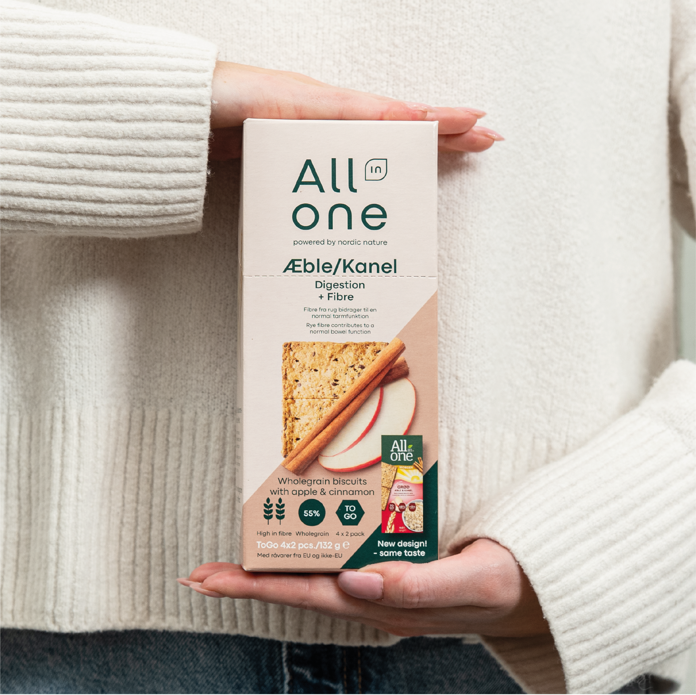


All in one has helped the Danes keep their blood sugar level in balance for years. The small cracker is easy to bring on the go and has a sensible nutritional composition.
But their old platform, focusing on health, had lost its relevance.
Brief
Based on the new recipe with added vitamins, minerals and ingredients from nordic nature, there was a need for a new brand platform for All in one - and a matching packaging design concept. The new design should reflect the new health platform based on unique brand assets, to reestablish relevance in the market.
Solution
The new All in one logo was made simpler and lighter, aiming for a more nordic and functional DNA.
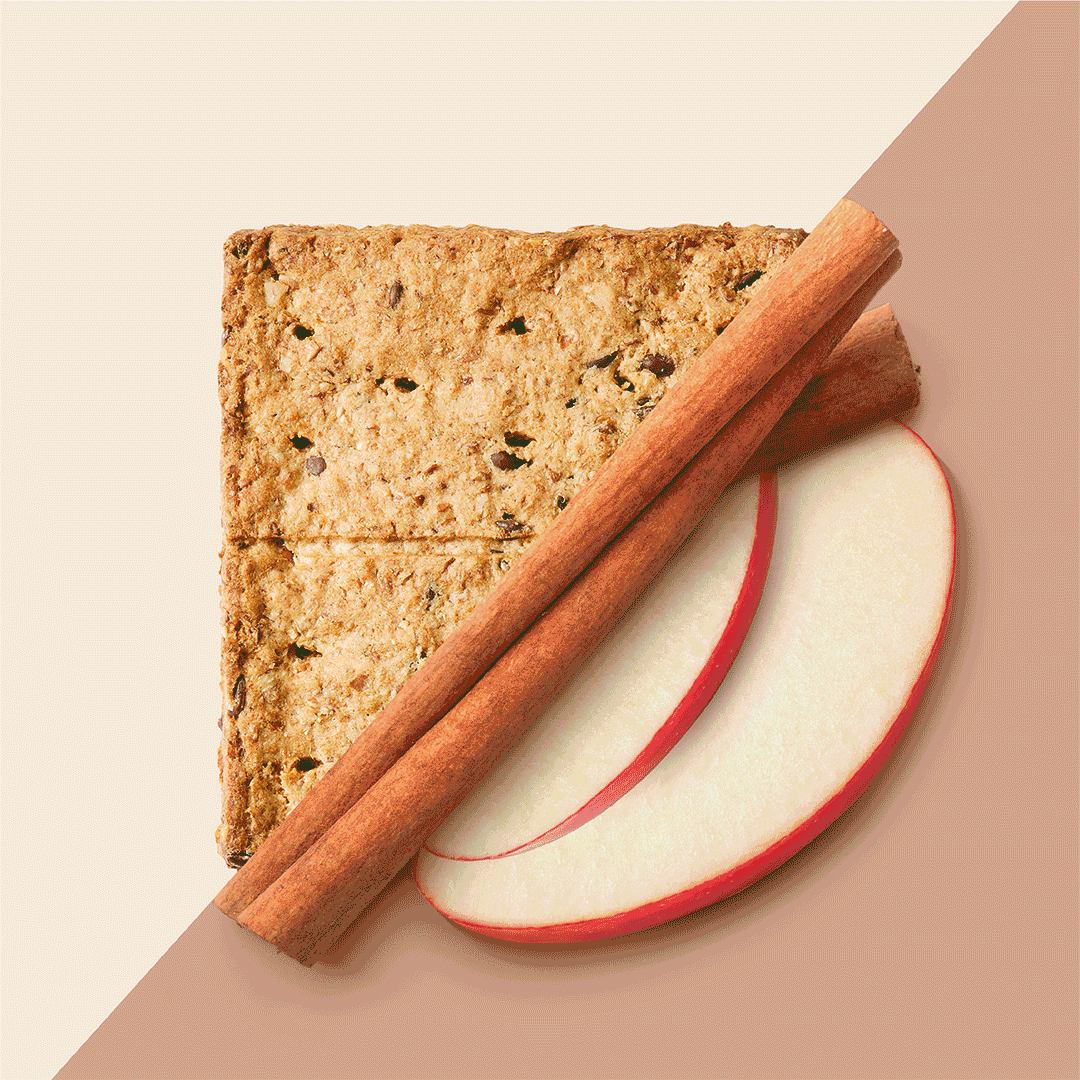
The heavy green colour was replaced by lighter tones, referencing the nordic nature to strengthen the appeal towards a feminine audience. The oblique cut used in the photo style presents both the cracker and the nutritious raw ingredients in them, and a simple system of icons was created to highlight the new USPs of a high fiber content and added vitamins and minerals.
All in all a solution that balances functional benefits with nordic nature.